In our third project, we had to create a three-dimensional form using polyhedral units.Before starting the project I researched many different polyhedral forms and masks African, Asian, Native American, and Aztec to name a few..
The first phase of the project involved making a mask. I wanted to use many stars to give it a mysterious and mystical feel. I noticed in a lot f the African masks that they had long faces and long noses. I wanted to incorporate this into my mask. I made my nose the largest part of my mask. Violet and yellow are complementary colors which I used in my mask. I used bright colors to add to the mystical idea.
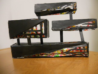
The second phase of the project involved using polyhedrals to create a wall structure. I use a twisted rectangles of all different lengths. I stacked them on top of one another leaving spaces to see through to the other side. The inside of the rectangles we painted multi color and the outsides were black. I chose to paint them this way because I pictured my wall structure in a space with white walls. I wanted to add subtle color. The cut outs in the rectangles allow for people to see the color from either side of the wall.


The outcome of both projects are interesting and consistent conceptually and esthetically.
ReplyDeleteI feel somehow the mask feels more developed as a piece, stronger visually. Your addition of " head/hair" flat pieces gave another dimension to the whole design.
The Wall Structure design follows a very interesting concept, I believe in terms of craftmanship and scale could have been developed further.
Also remember to take pictures of both pieces from different perspectives. There are visually interesting from all sides and it would be good to show their potential in full to blog viewers.
A-